GBCS Website Revamp
GBCS Website Revamp
GBCS Website Revamp
12 weeks | UI/UX Design | Internship

Overview
Overview
During my internship at SkyIT, GBCS Group, I led the process of GBCS Group’s website redesign, transforming it into a user-friendly, AI-powered platform that enhances usability and reflects the future of fleet management.
During my internship at SkyIT, GBCS Group, I led the process of GBCS Group’s website redesign, transforming it into a user-friendly, AI-powered platform that enhances usability and reflects the future of fleet management.
During my internship at SkyIT, GBCS Group, I led the process of GBCS Group’s website redesign, transforming it into a user-friendly, AI-powered platform that enhances usability and reflects the future of fleet management.
What I did
What I did
My role involved conducting user research, developing wireframes and prototypes, and optimizing the site’s information architecture. I collaborated closely with stakeholders, presenting design updates weekly to ensure a user-centered and forward-thinking solution.
My role involved conducting user research, developing wireframes and prototypes, and optimizing the site’s information architecture. I collaborated closely with stakeholders, presenting design updates weekly to ensure a user-centered and forward-thinking solution.
My role involved conducting user research, developing wireframes and prototypes, and optimizing the site’s information architecture. I collaborated closely with stakeholders, presenting design updates weekly to ensure a user-centered and forward-thinking solution.
Project Impact
Project Impact
50%
50%
Faster
Navigation
Faster
Navigation
40%
40%
Reduction in
Scrolling
Reduction in
Scrolling
25%
25%
Increase in
Engagement
Increase in
Engagement
20%
20%
More Demo
Requests
More Demo
Requests
Quick glance at the re-design
Quick glance at the re-design
As you scroll, you'll gain insights into the thought process, UX and psychology strategies, and other considerations that supported the redesign.
As you scroll, you'll gain insights into the thought process, UX and psychology strategies, and other considerations that supported the redesign.
As you scroll, you'll gain insights into the thought process, UX and psychology strategies, and other considerations that supported the redesign.
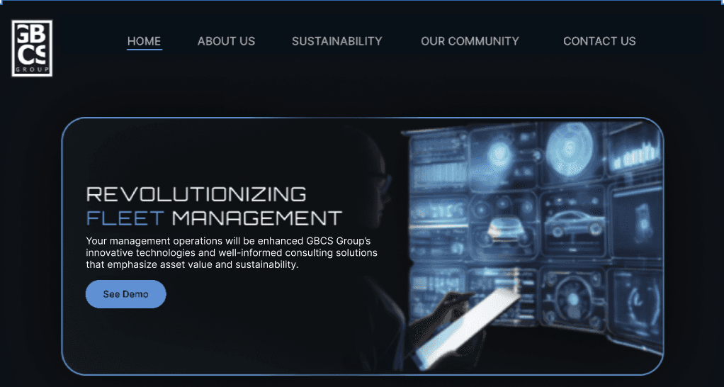
Enhanced navigation by displaying a clear, spread-out menu instead of using a hamburger icon.
Enhanced navigation by displaying a clear, spread-out menu instead of using a hamburger icon.
Enhanced navigation by displaying a clear, spread-out menu instead of using a hamburger icon.
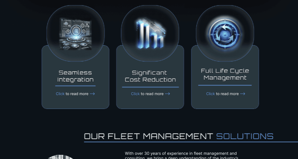
Presented services in a clean, organized layout for better visibility and understanding.
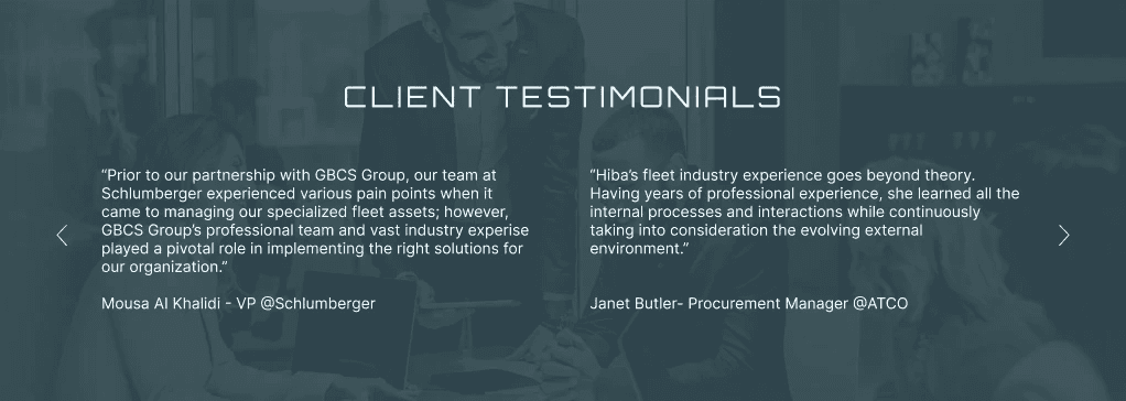
Added client testimonials to build credibility and establish trust.
Added client testimonials to build credibility and establish trust.
Added client testimonials to build credibility and establish trust.
View Redesign
Problem Statement
Problem Statement
The GBCS website suffers from outdated visual design, a lack of clear purpose and attention to detail, minimal interactivity, and limited user engagement, resulting in a subpar user experience and reduced effectiveness in meeting user needs.
The GBCS website suffers from outdated visual design, a lack of clear purpose and attention to detail, minimal interactivity, and limited user engagement, resulting in a subpar user experience and reduced effectiveness in meeting user needs.
The GBCS website suffers from outdated visual design, a lack of clear purpose and attention to detail, minimal interactivity, and limited user engagement, resulting in a subpar user experience and reduced effectiveness in meeting user needs.
Research Plan
Objective: Identify user pain points, expectations, and behaviors on the GBCS Group website to inform its redesign for better usability, engagement, and interactivity.
Objective: Identify user pain points, expectations, and behaviors on the GBCS Group website to inform its redesign for better usability, engagement, and interactivity.
Target Audience:
• Fleet managers & logistics professionals
• Business owners & decision-makers in transportation
• Potential clients interested in AI-powered fleet management
• Website visitors exploring GBCS services
• Fleet managers & logistics professionals
• Business owners & decision-makers in transportation
• Potential clients interested in AI-powered fleet management
• Website visitors exploring GBCS services
Research Activities:
• User Interviews: 8 participants over 4 days to assess navigation, content clarity, and visual appeal.
• Task Analysis: Observe users attempting key tasks (e.g., finding services, requesting a demo).
• Competitive Analysis: Benchmark against Verizon Connect, Samsara, and Fleetio for best practices.
Sample Interview Questions:
Sample Interview Questions:
• First impression of the website?
• Is service information easy to understand?
• Can you find what you need without excessive scrolling?
• What looks outdated?
• How can navigation improve?
• What would make the site more engaging?
• What would encourage a demo request?
• First impression of the website?
• Is service information easy to understand?
• Can you find what you need without excessive scrolling?
• What looks outdated?
• How can navigation improve?
• What would make the site more engaging?
• What would encourage a demo request?
Insights from the Interviews
Insights from the Interviews
Users found the website unclear and recommended clearer service explanations.
Design needed modern aesthetics, simpler fonts, and better readability.
Navigation was difficult; users suggested simpler menus, reduced scrolling, and prominent CTAs.
Content was scattered; users advised consolidating pages and adding videos or demos.
Suggestions to boost engagement included trial sign-ups, testimonials, and feedback options.


Scope for Improvement
Scope for Improvement
Redesign Navigation & Structure | Enhance Visual Design | Improve Content Clarity | Increase Interactivity & Engagement | Improve Responsiveness
Redesign Navigation & Structure: Implement a top-bar menu and condense content to reduce scrolling, making key information easier to find.
Enhance Visual Design: Update to a modern, minimalistic design with consistent colors, readable fonts, and better text/image alignment.
Improve Content Clarity: Simplify content to clearly communicate fleet management, products, and services, with real-life examples and use cases.
Increase Interactivity & Engagement: Add interactive elements like videos, demos, testimonials, CTAs, and visible contact options.
Improve Responsiveness: Ensure full responsiveness across all devices to enhance the mobile user experience.
Competitive Analysis
Competitive Analysis
After user interviews, we conducted a competitive analysis comparing GBCS Group with top fleet management websites like Verizon Connect, Samsara, and Fleetio, focusing on user experience and interface design to identify strengths and weaknesses.
After user interviews, we conducted a competitive analysis comparing GBCS Group with top fleet management websites like Verizon Connect, Samsara, and Fleetio, focusing on user experience and interface design to identify strengths and weaknesses.
After user interviews, we conducted a competitive analysis comparing GBCS Group with top fleet management websites like Verizon Connect, Samsara, and Fleetio, focusing on user experience and interface design to identify strengths and weaknesses.
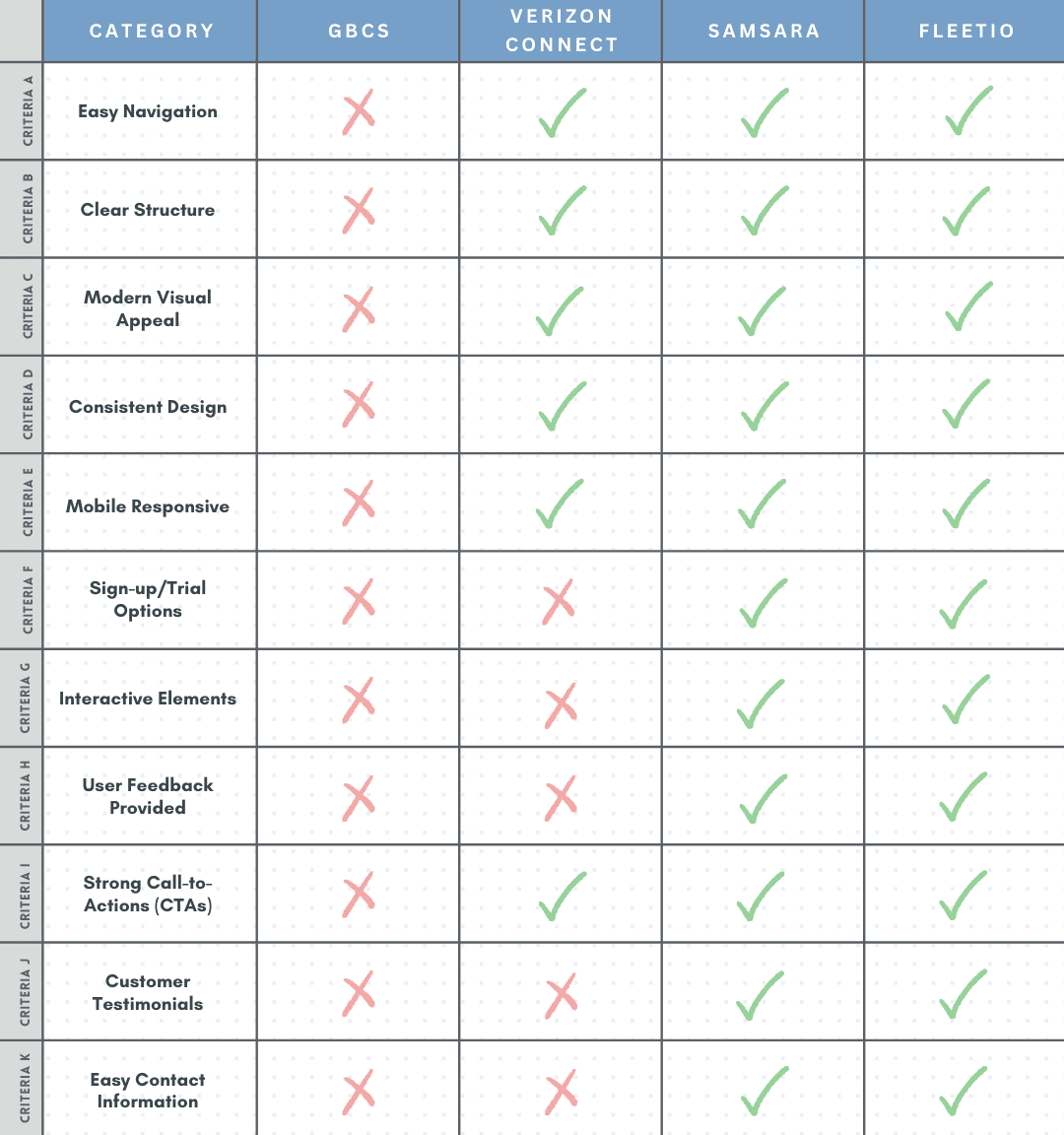
Usability Issues of the Old Design
Usability Issues of the current Design

Ideation & Brainstorming
Ideation & Brainstorming
Sketches were created to brainstorm and present redesign ideas for weekly stakeholder approval, enabling iterative refinement. Multiple versions with varying colors, layouts, and interactivity were developed. These sketches helped visualize ideas, align with stakeholders, and guide the project toward a user-centered design. The final version, refined through feedback, focused on a clear homepage flow to effectively communicate the company’s offerings.
Sketches were created to brainstorm and present redesign ideas for weekly stakeholder approval, enabling iterative refinement. Multiple versions with varying colors, layouts, and interactivity were developed. These sketches helped visualize ideas, align with stakeholders, and guide the project toward a user-centered design. The final version, refined through feedback, focused on a clear homepage flow to effectively communicate the company’s offerings.
Sketches were created to brainstorm and present redesign ideas for weekly stakeholder approval, enabling iterative refinement. Multiple versions with varying colors, layouts, and interactivity were developed. These sketches helped visualize ideas, align with stakeholders, and guide the project toward a user-centered design. The final version, refined through feedback, focused on a clear homepage flow to effectively communicate the company’s offerings.

Design Systems
Design Systems
Using Figma, I created low-fidelity wireframes and refined them by incorporating images from the graphic designer and AI-generated visuals. I made 24-30 iterations, mainly focused on the homepage, and adjusted the design based on stakeholder feedback and usability insights.
Using Figma, I created low-fidelity wireframes and refined them by incorporating images from the graphic designer and AI-generated visuals. I made 24-30 iterations, mainly focused on the homepage, and adjusted the design based on stakeholder feedback and usability insights.
Using Figma, I created low-fidelity wireframes and refined them by incorporating images from the graphic designer and AI-generated visuals. I made 24-30 iterations, mainly focused on the homepage, and adjusted the design based on stakeholder feedback and usability insights.
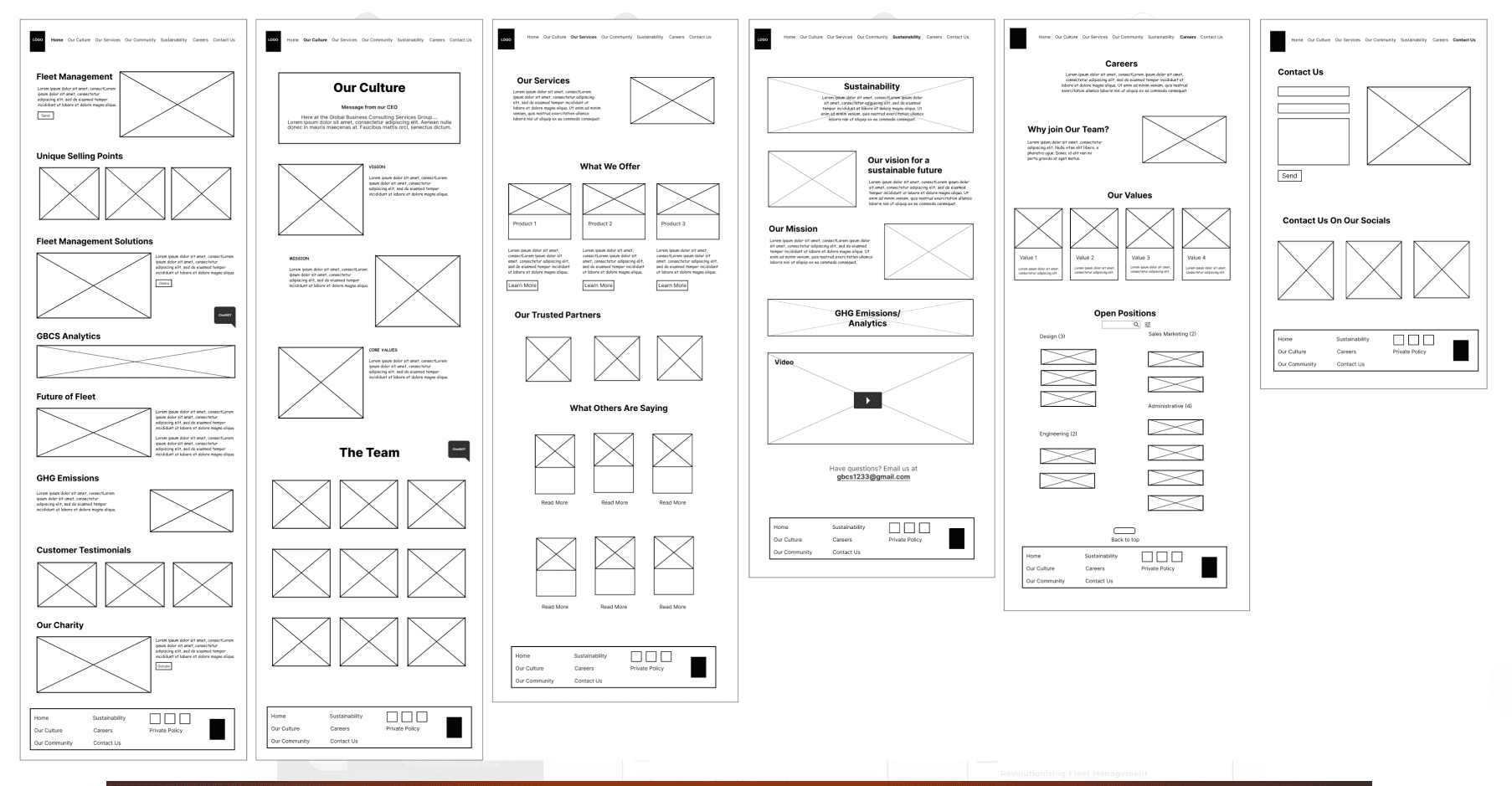
Wireframes
Wireframes
Using Figma, I created low-fidelity wireframes and refined them by incorporating images from the graphic designer and AI-generated visuals. I made 24-30 iterations, mainly focused on the homepage, and adjusted the design based on stakeholder feedback and usability insights.
Using Figma, I created low-fidelity wireframes and refined them by incorporating images from the graphic designer and AI-generated visuals. I made 24-30 iterations, mainly focused on the homepage, and adjusted the design based on stakeholder feedback and usability insights.
Using Figma, I created low-fidelity wireframes and refined them by incorporating images from the graphic designer and AI-generated visuals. I made 24-30 iterations, mainly focused on the homepage, and adjusted the design based on stakeholder feedback and usability insights.
High Fidelitiy Design
High Fidelitiy Design
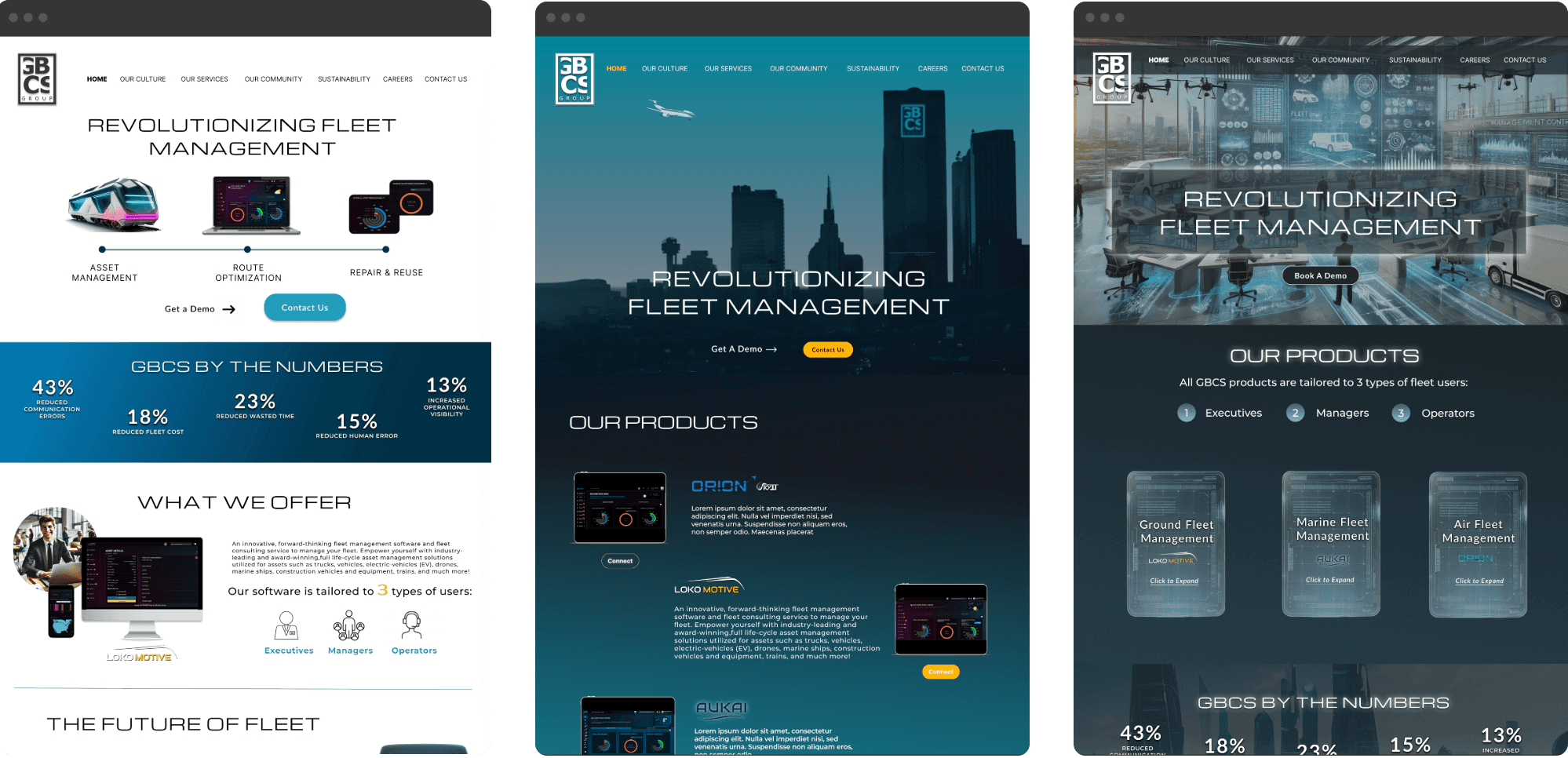
After addressing UX issues, I designed the desktop homepage in Figma. The stakeholders wanted a unique, engaging website with an element of surprise. We explored interactive features like parallax effects and, after several iterations, chose a futuristic theme. This design, featuring holograms, a dark theme, and blue hues, aligns with the brand’s “Space is not the limit” message.
After addressing UX issues, I designed the desktop homepage in Figma. The stakeholders wanted a unique, engaging website with an element of surprise. We explored interactive features like parallax effects and, after several iterations, chose a futuristic theme. This design, featuring holograms, a dark theme, and blue hues, aligns with the brand’s “Space is not the limit” message.
After addressing UX issues, I designed the desktop homepage in Figma. The stakeholders wanted a unique, engaging website with an element of surprise. We explored interactive features like parallax effects and, after several iterations, chose a futuristic theme. This design, featuring holograms, a dark theme, and blue hues, aligns with the brand’s “Space is not the limit” message.
Final Design
Final Design
Scroll through the screen
Scroll through the screen
Scroll through the screen


Outcomes & Next Steps
Outcomes & Next Steps
We successfully launched the first phase of the design - Homepage. The next phase was to design the other pages of the website, ensuring consistency in layout, visual style, and user experience across the entire platform.
We successfully launched the first phase of the design - Homepage. The next phase was to design the other pages of the website, ensuring consistency in layout, visual style, and user experience across the entire platform.
We successfully launched the first phase of the design - Homepage. The next phase was to design the other pages of the website, ensuring consistency in layout, visual style, and user experience across the entire platform.
50%
50%
Faster
Navigation
Faster
Navigation
40%
40%
Reduction in
Scrolling
Reduction in
Scrolling
25%
25%
Increase in
Engagement
Increase in
Engagement
20%
20%
More Demo
Requests
More Demo
Requests
Learnings & Reflection
Learnings & Reflection
• If given more time, I would have tested the mid-fidelity designs to validate layout choices early.
• I would aim for tighter design iterations between layout validation and visual design to avoid major pivots late in the process.
• My growth as a designer was I learned to be flexible, to adapt on the go, and be aware of process optimization.